
Are you just starting out in web design and feeling a bit lost? You’re not alone! Many beginners find the world of web design overwhelming at first. But don’t worry, this guide is here to help you create a simple web page that looks great and works well. We’ll walk you through the basics of beginner simple web page design, covering everything from layout to color choices. By the end of this article, you’ll have the tools you need to start your first project with confidence!
Key Takeaways
- Start with a clean and organized layout to make navigation easy.
- Choose a color palette that resonates with your audience and enhances the mood of your site.
- Pick readable fonts and establish a clear text hierarchy for better communication.
- Use white space wisely to give your content room to breathe and improve overall design.
- Always consider user experience by making your site intuitive and easy to use.
Start With A Simple Layout
When you’re just starting out with web design, it’s super tempting to throw everything you can think of onto the page. Resist that urge! A clean, simple layout is way more effective and user-friendly. Think of it like organizing your room – you wouldn’t just dump everything in the middle, right? Same principle applies here. Let’s break down how to achieve that simplicity.
Keep It Clean and Organized
Clutter is the enemy. Seriously. Too many elements fighting for attention will just confuse your visitors. Stick to the essentials. What’s the main message you want to convey? Focus on that, and cut out anything that doesn’t directly support it. Use clear headings, short paragraphs, and plenty of white space to make the content easy to scan. Think minimalist design – less is often more.
Use Grids for Structure
Grids are your best friend when it comes to creating a structured layout. They help you align elements consistently and create a sense of order. Don’t worry, you don’t need to be a math whiz to use them. There are plenty of CSS frameworks and tools that make implementing a grid system a breeze. Experiment with different grid structures to see what works best for your content.
Focus on Key Elements
Every page should have a clear focal point. What’s the first thing you want visitors to see? Make sure that element stands out, whether it’s a headline, an image, or a call to action. Use visual hierarchy to guide the eye. Make important elements larger, bolder, or more colorful. And remember, every element should serve a purpose. If it doesn’t, get rid of it!
Starting simple doesn’t mean your website has to be boring. It just means you’re prioritizing clarity and usability. You can always add more complexity later, but it’s much harder to simplify a cluttered design.
Choose The Right Color Palette
Okay, so colors! This is where things get really fun, but also where it’s easy to get overwhelmed. Don’t sweat it. We’ll break it down. Picking the right colors can make or break your site. It’s not just about what looks good, but also what feels right. Let’s get into it.
Understanding Color Theory
Color theory sounds intimidating, but it’s really just about how colors interact. Think of the color wheel you probably saw in art class. Colors opposite each other are "complementary" – like red and green, or blue and orange. These combos can be super eye-catching, but use them carefully! Colors next to each other are "analogous" – like blue, blue-green, and green. These create a more chill, harmonious vibe.
- Primary Colors: Red, yellow, blue.
- Secondary Colors: Green, orange, purple (made by mixing primary colors).
- Tertiary Colors: Colors made by mixing a primary and a secondary color, like red-orange or blue-violet.
Understanding these relationships helps you create balanced and visually appealing palettes. Don’t be afraid to experiment and see what works for you.
Using Colors to Evoke Emotion
Colors aren’t just pretty; they make us feel things. Blue often feels trustworthy and calm, which is why a lot of banks use it. Red can feel exciting or urgent, so it’s great for call-to-action buttons. Yellow is happy and energetic. Think about what emotions you want people to feel when they visit your site, and then choose a color scheme that matches.
Consider these points:
- Brand Identity: What does your brand stand for?
- Target Audience: Who are you trying to reach?
- Desired Mood: What feeling do you want to create?
Tools for Color Selection
Luckily, you don’t have to guess! There are tons of free tools out there to help you pick awesome color palettes. Coolors is a great one – it lets you generate palettes with a single click. Adobe Color is another solid choice; it lets you explore existing palettes or create your own based on color theory rules. And don’t forget about accessibility! Make sure your text has enough contrast against the background so everyone can read it easily. There are contrast checker tools online that can help with this. Remember to use brand colors strategically.
Typography Matters
Okay, so you’ve got your layout sorted and your color scheme looking fly. Now it’s time to talk about typography. Don’t underestimate this part – it’s way more than just picking a font you like. It’s about making your site readable, engaging, and, dare I say, beautiful.
Selecting Fonts That Fit Your Style
Choosing fonts is like picking clothes for your website. You want something that fits the occasion, right? A playful blog might rock a quirky, hand-drawn font, while a corporate site probably needs something more professional, like sans-serif fonts. Think about the message you’re trying to send. Are you going for modern and clean, or classic and elegant? Your font choice should reflect that.
Creating Hierarchy with Text
Imagine a page where everything is the same size and weight. Nightmare, right? That’s where text hierarchy comes in. Use different font sizes and weights to guide your reader’s eye. Headings should be big and bold, subheadings a bit smaller, and body text easy to read. It’s like creating a visual roadmap for your content. Here’s a simple example:
- Heading 1: (Largest, Boldest)
- Heading 2: (Slightly Smaller, Still Bold)
- Body Text: (Regular Size, Easy to Read)
Ensuring Readability Across Devices
This is a big one. Your website needs to look good on everything from a giant desktop monitor to a tiny smartphone screen. That means choosing fonts that are readable at different sizes and on different devices. Test your fonts on various devices to make sure they don’t turn into a blurry mess. Also, pay attention to line height and letter spacing – these can make a huge difference in website readability.
Remember, good typography isn’t just about aesthetics; it’s about making your content accessible and enjoyable for everyone. It’s about creating a seamless reading experience that keeps people engaged and coming back for more.
Embrace White Space
Okay, so you’ve got your layout, colors, and fonts sorted. Now, let’s talk about something that’s often overlooked but makes a HUGE difference: white space. Or, as some designers like to call it, negative space. It’s not just empty space; it’s a design element in itself. Think of it like the pauses in a song – they’re just as important as the notes.
The Importance of Negative Space
White space helps to make your website look less cluttered and more inviting. It gives the user’s eyes a break and allows them to focus on the important stuff. It’s like giving your content room to breathe. Without it, everything feels cramped and overwhelming. I’ve seen so many sites that try to cram everything above the fold, and it just ends up looking like a digital yard sale. Don’t be that site!
Balancing Content and Space
Finding the right balance is key. You don’t want so much white space that your site feels empty and unfinished, but you also don’t want so little that it feels claustrophobic. A good rule of thumb is to prioritize readability and user experience. Ask yourself: Is the text easy to read? Can users easily find what they’re looking for? If the answer is no, you probably need more white space. Think about how online marketing can be enhanced with a clean design.
Using Margins and Padding Effectively
Margins and padding are your best friends when it comes to creating white space. Use them generously to separate elements and create visual hierarchy. Here’s a quick rundown:
- Margins: The space outside an element’s border.
- Padding: The space inside an element’s border.
- Consistency: Keep your margins and padding consistent throughout your site for a polished, professional look.
I remember one time I was working on a site and just couldn’t figure out why it looked so bad. Turns out, I had completely neglected the margins and padding. Once I added some breathing room, the whole site transformed. It was like magic!
Here’s a simple example of how margins and padding can affect the look of your site:
| Element | Margin | Padding |
|---|---|---|
| Heading | 20px | 10px |
| Paragraph | 10px | 5px |
| Image | 15px | 0px |
Design for User Experience
Okay, so you’ve got a layout, colors, fonts, and some nice white space. Now, let’s make sure people actually enjoy using your site. That’s where User Experience (UX) comes in. It’s all about making things easy and pleasant for your visitors. Think of it as being a good host, but for the internet.
Understanding Your Audience
First things first: who are you building this site for? Seriously, take a minute. Are they tech-savvy teens, or retirees looking for gardening tips? Knowing your audience is key. What are their needs? What are their pain points? What kind of language do they use? Do some research! Send out surveys, check out forums where they hang out, and really try to get inside their heads. This will help you tailor your design and content to their specific requirements.
Creating Intuitive Navigation
Make it easy to get around. Nobody likes getting lost, especially on the internet. Your navigation should be clear, simple, and consistent. Use a logical menu structure, and make sure people can always find their way back to the homepage. Think about how users will flow through your site.
- Use clear and concise labels for menu items.
- Keep the number of menu items manageable (no one wants to scroll through a mile-long list).
- Use breadcrumbs to show users where they are in the site hierarchy.
Testing for Usability
Don’t just assume your site is easy to use. Test it! Get some friends, family members, or even strangers to try using your site and watch what they do. Where do they get stuck? What confuses them? What do they love? Use their feedback to make improvements. Usability testing doesn’t have to be fancy or expensive. Even a simple round of testing can reveal major issues. Remember, it’s better to find these problems now than to have your visitors discover them later.
User experience is all about empathy. Put yourself in your users’ shoes and try to see your site from their perspective. What would make their experience better? What would make them want to come back? By focusing on your users, you can create a website that’s not only beautiful but also a joy to use.
Optimize for Mobile Devices
Responsive Design Basics
Okay, so you’ve got a website. Awesome! But does it look good on phones? That’s where responsive design comes in. It’s all about making your site adapt to different screen sizes. Think of it like this: your website should be a chameleon, changing its appearance to fit whatever device it’s on. If you don’t, you’re basically telling a huge chunk of potential visitors that you don’t care about their experience. And nobody wants that!
Testing on Different Screen Sizes
Don’t just assume your site looks great on every phone. You gotta test it! Grab your friend’s old Android, borrow your mom’s iPad, and see how your site behaves. There are also online tools that let you simulate different devices. Pay attention to how text wraps, how images load, and whether buttons are easy to tap. If something looks wonky, fix it! It’s better to catch those issues now than to have users bounce because your site is a mess on their mobile devices.
Mobile-Friendly Features to Include
So, what makes a website mobile-friendly? Here are a few things to keep in mind:
- Fast loading times: Nobody wants to wait forever for a page to load, especially on mobile. Optimize your images and code to keep things speedy.
- Easy navigation: Make sure your menu is simple and easy to use on a small screen. A hamburger menu (those three little lines) is a classic for a reason.
- Touch-friendly buttons: Make sure buttons are big enough to tap easily with a finger. No one wants to struggle to click a tiny link.
Mobile-first design is becoming increasingly important. Consider designing for mobile first, then scaling up to larger screens. This ensures that the core experience is great on mobile, rather than an afterthought.
Also, consider these points:
- Use readable font sizes.
- Avoid large tables that don’t fit on smaller screens.
- Keep forms short and sweet.
Incorporate Engaging Visuals
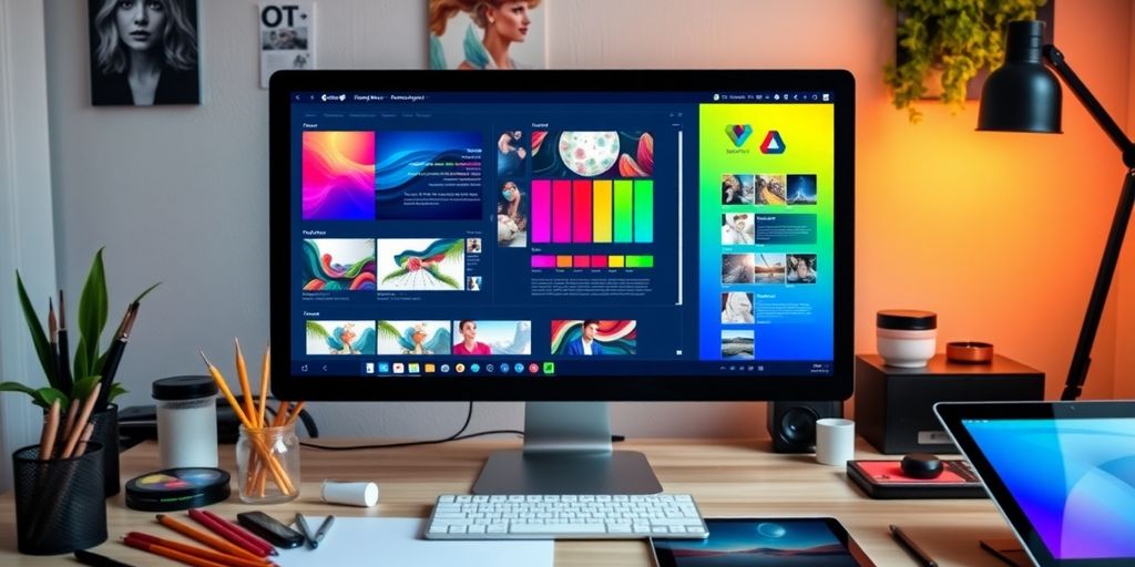
Visuals are super important! They can really make or break a website. People are drawn to interesting images and graphics, so let’s talk about how to use them effectively.
Choosing the Right Images
Okay, so first things first: quality matters. Ditch the blurry, pixelated pics. Opt for high-resolution images that are clear and relevant to your content. Think about what story you’re trying to tell. A picture is worth a thousand words, right? Make sure those words are saying what you want them to say. Also, consider the file size. Nobody wants to wait forever for a page to load. Optimize those images! You can use tools to compress them without losing too much quality. It’s a balancing act, but it’s worth it. Think about using custom websites to showcase your images.
Using Icons and Graphics
Icons and graphics can add a nice touch of visual interest without being overwhelming. They can also help break up text and make your site easier to navigate. But don’t go overboard! A few well-placed icons are way better than a million distracting ones. Make sure they’re consistent with your overall design. If you’re using a minimalist theme, stick with simple, clean icons. If you’re going for something more playful, you can get away with something a little more elaborate. Think about using icons to highlight key features or benefits. It’s a great way to draw attention to what’s important.
Creating a Visual Story
Think of your website as a story, and use visuals to help tell it. Use images and graphics to guide the user through your content. Create a visual hierarchy that leads the eye where you want it to go. For example:
- Start with a strong hero image that grabs attention.
- Use smaller images to illustrate key points.
- Incorporate graphics to break up text and add visual interest.
Remember, visuals should enhance your content, not distract from it. They should support your message and help you connect with your audience on an emotional level. Don’t just throw in random pictures because they look pretty. Make sure they serve a purpose and contribute to the overall story you’re trying to tell.
And hey, don’t be afraid to experiment! Try different things and see what works best for you. The most important thing is to have fun and let your creativity shine through.
Wrapping It Up
So there you have it! Designing your first web page doesn’t have to be a huge headache. Just remember to keep it simple, play around with colors, and don’t stress too much about making everything perfect right away. Everyone starts somewhere, and the more you practice, the better you’ll get. Take your time, enjoy the process, and before you know it, you’ll have a cool website to show off. Happy designing!
Frequently Asked Questions
What is the first step to designing a simple web page?
Start with a basic layout that is clean and organized. This helps to make your page easy to navigate.
How do I choose colors for my website?
Use a color palette that fits the mood you want to create. You can find tools online to help you pick colors that go well together.
Why is typography important in web design?
Typography helps convey your message clearly. Choose fonts that are easy to read and match the style of your website.
What is white space and why should I use it?
White space, or negative space, is the empty space around elements on your page. It helps improve readability and makes your design look cleaner.
How can I make my website user-friendly?
Focus on understanding your audience and create easy-to-use navigation. Test your site with real users to see if they find it simple to use.
Why is it important to optimize my website for mobile devices?
Many people use their phones to browse the web. A mobile-friendly design ensures that your site looks good and works well on smaller screens.